The Map View: They Don't Love You Like I Love You
A map for a construction CRM, and the pins that were never really there.

One of the main reasons you invest in a Salesforce implementation is to gain access to valuable insights about your data. But just like with anything new, you don't know what you don't know. And that's why most organizations rely on an expert consulting partner to tell them what those valuable insights are and how to find them. Otherwise you would just end up recreating the spreadsheet(s) and dashboards you were previously using. That sounds great at first. Especially for adoption: get people into the system and have them do something familiar there to expedite the training and onboarding. That maybe works for a little while, but soon enough the login friction becomes a barrier to doing something the same way you were already doing it in spreadsheets, and months later everyone is wondering why your Salesforce implementation didn't change your business at all. So the system has to be valuable enough to make it worth putting up with that login friction.
If you sit in enough pursuit review meetings, you eventually notice one question showing up in all of them, wearing different outfits: have we built anything like this near here? It's a fair question. In construction, proximity is credibility. Owners want the team that knows the local market, the local subs, and the local permit office's particular moods. Nothing wins an interview like pointing at a building twenty minutes down the road and saying "we did that one."
The answer to that question usually lives in a shared drive, three spreadsheets, and somebody's memory of a job from 2019. So when I say the ask was "show me our work on a map," understand that what everyone actually wanted was to stop performing the scavenger hunt. And that is not easy to do with a spreadsheet.
Why build it at all?
AEC is an extremely visual industry. The whole business centers on creating real things you can see and touch, and the people in it think that way too. I find that when explaining anything technical or tedious, it's best to demonstrate it visually. That extends to the data.
I usually don't get too involved with our customer builds until well after the core TrebleHook product is stood up and the customer has a complicated requirement that needs to be solved mindfully. Not that my team isn't capable of doing that, but:
- I like solving complicated problems and
- I control the work assignments so of course I get to take on all the fun stuff I like.
Sometimes what can happen once we get to that point is that the customer can decide that the cost of the custom path is too high. It could take 20-30 hours to build and deploy a custom LWC from scratch. At that point there are essentially 4 choices:
- Pay for the hours to do the custom build
- Pay for less hours to build something worse
- Let the requirement rot at the bottom of the backlog
- Visit the AppExchange and pray that there is something close to what you need and for a reasonable price (and that they stay in business)
Every time this requirement came up for the past couple years I would queue up the AppExchange speech I have memorized to deliver to customers when I have been defeated by technical or budget barriers. But I recently partnered with an AI coding agent to build a business card scanner that takes a picture of a business card from your Salesforce app, scrapes all of the Contact and Account details using OCR, passes it through AI to clean up the details, and inserts the deduplicated records cleanly into your TrebleHook org, so I'm feeling pretty unstoppable right about now. Let's see if this is another requirement we can dig out of the backlog graveyard and use AI to build something cool.
What was I thinking?
Here's the thing about maps in the Salesforce world: there isn't really an out-of-the-box answer. Salesforce gives developers a base map component you can mess around with, but it wears Google's look and you can't change it. Salesforce sells a full mapping product as a paid add-on. You could pay for Tableau I guess, but that's probably overkill if you're mostly interested in the map view. And the AppExchange fills out the rest of the space with plotting tools. Similar to the Business Card Scanner, I have relied on those third-party plotters in the past. We tried a couple different ones on maybe a half-dozen TrebleHook implementations, and they were ok. They had the data, and technically they showed the records on a map. But they were not pretty. And there isn't much you can do about that with an installed package. That's the trade you make on the AppExchange: you hand over control of the UI. For a tool whose entire job is to be looked at in front of a room, that's brutal.
So I figured building our own would be easy. (You would think I'd have learned my lesson about assumptions from the card scanner. I had not.)
The thing is, the questions firms actually want a map to answer are harder than "where are the dots." Where have we won? Where have we never broken in? Who owns which territory, and is it healthy? And the big one, the one that shows up in every interview prep: what have we built near this pursuit that proves we can do it again? Those are territory, proximity, and history questions. The standard map answers none of them. It shows you dots.
Here was the plan:
- Drop in the map component Salesforce already ships
- Pin our projects and clients
- Color the pins by stage
- Add filters and a list
- Ship it and accept the applause
Simple. (Foreshadowing. Again.)
How did I test it?
Starting on the standard component was the right call for speed: Claudio and I had a working map fast. Pins, filters, stage colors, a list beside it.
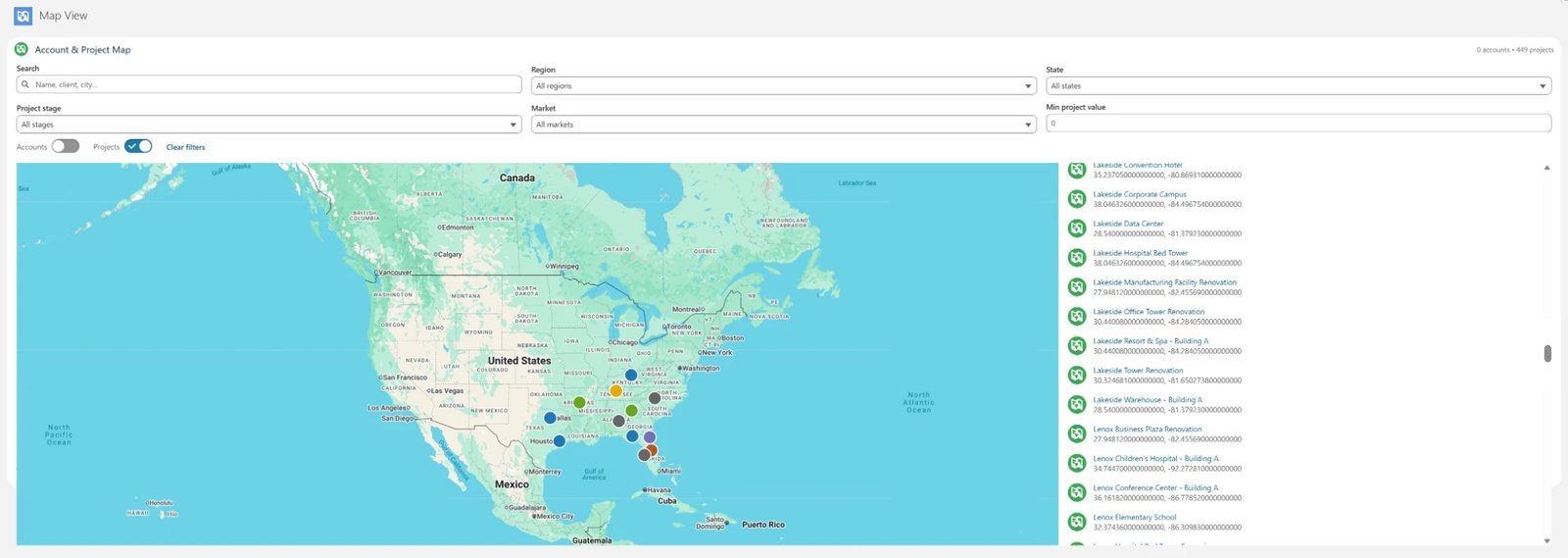
I caught one bug myself on review, and I mention it because it's the exact kind the machine makes quietly: the map stores a location as a pair of numbers, and the code read that pair in the wrong format, which silently threw away every coordinate it touched. No error. Just a map with amnesia. Fixed before anyone saw it. Barely.
There is only one way to test a map, and that is to look at it. Deployed, on the real org, with the data loaded. Nearly every fix in this build started with my eyeballs on a screen: a map that came up empty, an icon that rendered as absolutely nothing with no error anywhere, a list showing raw latitude and longitude to people who wanted addresses. None of that shows up in a test suite. Claudio cannot see the screen. That's not a complaint about the tool. It's the job description of the human in the loop.
What went wrong?
I merged the code and went to admire my map. Nothing. I refreshed. Nothing. Merging code into the repository and deploying it to the org are two different events, and only one of them changes what's on the screen. I know that. I knew that then. And yet.
A merge is not a deploy.
Then the deploy itself failed, and not because of anything the map did. Salesforce deploys are all or nothing, and an unrelated component in the repo had drifted out of date with the org, so it dragged the whole thing down with it. We switched to deploying only the new files and moved on.
Then the map loaded and immediately broke with "no such column." This one is a platform quirk worth writing down: when an org turns on Salesforce's built-in state and country picklists, the field that stores a state quietly changes its internal name. Code that assumes one name breaks on any org configured the other way. The fix was to stop assuming and ask the org at runtime what its own fields are called. (A theme was developing around assumptions.)
Then a brand mockup showed up, and the standard component hit its ceiling: the basemap cannot be restyled. It looks like Google Maps because it is Google Maps, and it will not wear your colors no matter how nicely you ask. To match the mockup, we rebuilt the whole thing on Leaflet, a widely used open-source mapping library, with map imagery that can actually take a brand.
And that's when the pins disappeared. Not some of them. Basically ALL of them.
Here's what was going on. A map can only place a pin if it knows the exact latitude and longitude of the spot. Turning a street address into those two numbers is called geocoding, and it's the step everybody forgets exists. The standard component had been quietly geocoding every address on the fly, behind the scenes, so pins appeared and everyone assumed our data was mappable. The new map made no such assumption. It plots only coordinates that are actually stored on the record, and almost none of our records had ever been geocoded. The old map wasn't displaying our data. It was covering for it.
The pins were never real until they were made real.
So the job changed from "add map features" to "build a geocoding pipeline." A background job now takes every address, runs it through a free US government geocoding service, and writes the coordinates back onto the record. From then on, every pin on the map is a fact.
Even that had one more trap in it. The pipeline ran, the new coordinates field had data, and the map was still blank. The field wasn't missing. It was invisible. On a locked-down org, a newly created field is hidden from users by default, so the person viewing the map genuinely could not see it, and the code quietly fell back to the no-coordinates path. Two fixes: grant people permission to see the field, and make the code steady enough to keep going when a field is hidden instead of falling over.
The small stuff rounds out the list: a delete button that didn't delete because a cached read kept serving the pre-delete list, an office icon that rendered as blank because the icon name didn't exist (no error, nothing, just absence), and a layout I built twice because a second mockup arrived and moved everything to the opposite side of the screen from where the first round of feedback had just put it. That last one isn't a bug. That's just what building for humans looks like.
How did I even pull it off?
Same way as the card scanner, and that's kind of the point. Same division of labor: I directed, looked at the deployed screen, and pushed back with screenshots; Claudio wrote the code, deployed it, and probed the org. Except this time the ground was harder. A mapping library, a geocoding pipeline, and a security model I hadn't touched, stacked on a framework I was still pretty new to.
The split held anyway, and it held along exactly the lines you'd expect. Every visual defect was mine to catch, because the model cannot see the screen. The invisible-field diagnosis came from checking the org by hand when the error messages pointed somewhere else. And the industry judgment was the part no amount of code generation covers: knowing which stages count as won, why a preconstruction lead cares about backlog, and why "near here" deserves to be an entire feature. Claudio could write the math that decides whether a pin sits inside a drawn territory. It could not know why anyone would draw one.
So what does it look like now?
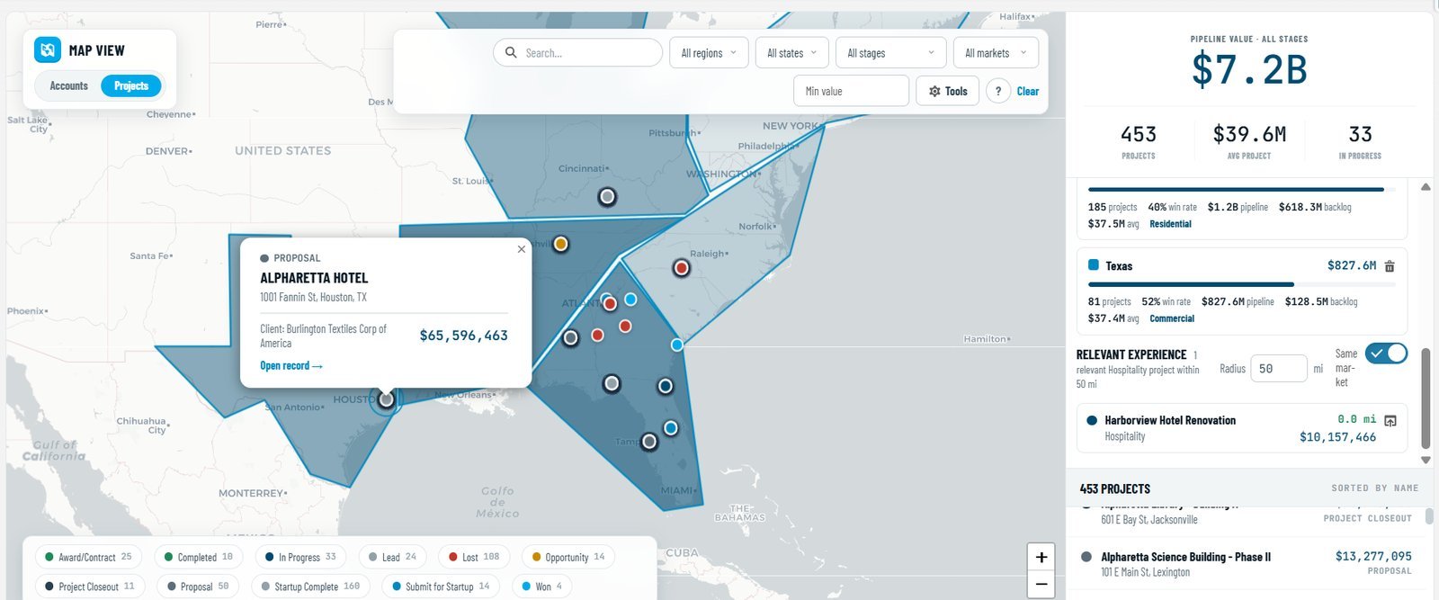
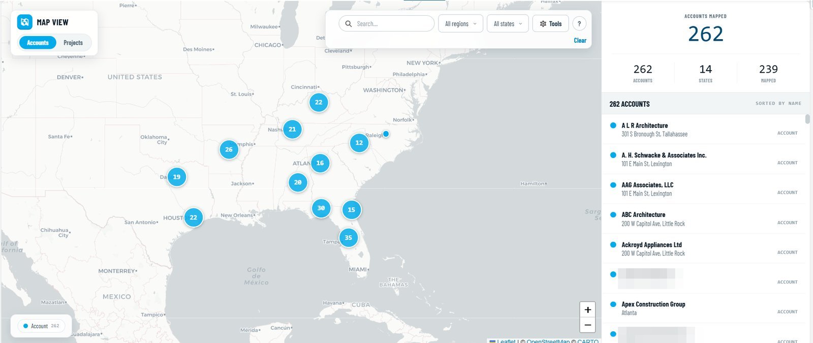
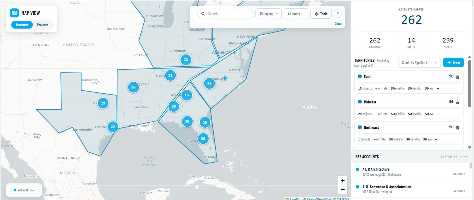
- The basemap wears the brand, which the standard component simply cannot do.
- You can draw territories directly on the map and each one gets a live scorecard: win rate, pipeline, backlog, and top market inside that shape.
- The interview question became a feature. Pick a pursuit, set a radius, and see every won or built project nearby, optionally filtered to the same market. The "have we built anything like this near here" slide now builds itself.
- Hundreds of pins gather into clusters as you zoom out and size themselves by project value, so the map reads at any altitude.
- A time-lapse slider plays the firm's history forward year by year, which is the fastest way I've found to show someone how a market got won.
- Offices sit on their own layer, so "how far is this from our nearest office" stops being a guess.
Every number in these screenshots is invented demo data, which is the only reason you're seeing them.
Was it worth it?
My answer is the same one that I imagine John Spence gave Gwen Stefani when she asked what the name of the band was: “No Doubt!”
This is better than anything I was able to pull together for customers before being able to build it. The base component wears Google's face and shows raw coordinates where people want addresses. The paid add-on is a licensing conversation. The AppExchange plotters do the plotting and take the UI hostage. Ours is branded, honest about which records are really placed, and built to answer the questions a construction firm actually asks a map: territory, proximity, and history.
It also settled something for me about the way I've been building. The card scanner could have been a lucky first swing. This was a harder problem in unfamiliar territory, and the same method held the whole way through: start from a real need, let the machine be wrong where it's cheap to be wrong, and test against the deployed, visible, real thing until it holds.
The answer is a filter, a radius, and about four seconds.
Because that's what this comes down to. When somebody in a pursuit meeting asks whether we've built anything like this near here, the answer used to be a scavenger hunt through shared drives and somebody's memory. Now it's a filter, a radius, and about four seconds. I know which one I'd rather present from.